Intentional designs
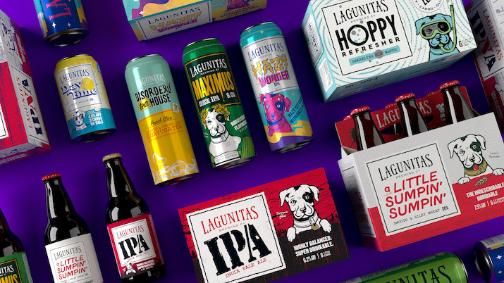
Image: Lagunitas Brewing Company
Anne-Marie Hardie explores some of some of the latest limited edition launches by beverage companies in the US wanting to engage with their consumers and highlight core brand values during the festive season
The continued rise of e-commerce and limited shelf space has pushed packaging design to the forefront. Food and beverage manufacturers must develop a packaging design that stands out while strengthening connections to their brand. The holidays present an opportunity for companies to become more playful with their designs, and investing the time to add these creative elements will help entice consumers to interact with their products. December is the season for innovation, with cans providing the perfect foundation to launch creative designs that showcase their brand’s personality and values.
Elevating demand with limited edition launches
Shifting the design of cans during the holiday season remains an effective strategy for drawing attention and instigating demand. One highly effective method is when companies use images in the design to connect with their customers’ core values. Over the last few years, Budweiser has become known for its holiday cans, creating thoughtful designs that relate to its consumers’ values. This year’s theme for Budweiser was nostalgia, which included developing a package that tied together Budweiser’s history with the holiday season. The design features seasonal colours and several elements of Budweiser’s brand, including its well-known Clydesdales, an icon that has been used since the 1930s, and a vintage Budweiser bow tie. This year the company also launched a recognition programme to honour those Americans who must work during the holiday season, where they can enter a sweepstake to win gift cards.
The gift-giving element of the holidays provides an opportunity for consumers to reconnect with their tried-and-true brands while discovering new ones. Holiday gift packages with uniquely designed cans continue to help drive demand in the winter season. Some companies are taking this one step further and are bringing their products together to create a seasonal experience. This year California-based Graham and Fisk’s Wine-In-A-Can developed two variety packs marketed explicitly towards the holiday season. The company’s 12 Cans of Christmas give consumers a unique gift idea for the wine lover on their list, while the 24-can advent calendar provides adults with a creative twist on the Christmas countdown.
Developing packaging design to help celebrate the holiday season is just one way that companies use packaging to drive demand for their canned product. Brands are beginning to recognise the benefit of adding transitional packaging to their line-up throughout the year.

Image: Graham and Fisk’s Wine-In-A-Can
Showcasing brand values
Levia, Georgetown, Massachusetts, is one company that has embraced the seasons when designing its cans and determining the product flavours.
“By offering up something new and innovative a few times a year, it keeps our consumers engaged and intrigued on what will be releasing next,” said Troy Brosnan, co-founder, Levia. “It also gives us the opportunity to network with local artists to keep the Massachusetts-based brand as authentic as possible. In addition, seasonal offerings are well-promoted within our retail partner relationships, driving more interest and traffic to their brick-and-mortar locations.”
Levia first experimented with seasonal cans in February 2021 to introduce its limited-edition flavour, Cranberry Lime. “Consumers are used to seasonal or limited editions in the alcohol space, so we thought that the model would work well,” shared Brosnan. “The response was amazing! So now we introduce seasonal and limited-edition flavours throughout the year.”
When creating its newly launched Pomegranate Punch flavour, Levia reached out to Massachusetts-based illustrator, Dean McKeever, for the design. The goal was to provide consumers with a label that would spark winter nostalgia. “His inspiration truly was derived from the season of winter itself, incorporating marquee winter staples such as the snowman graphic while tapping into the cool, crisp use of blues and whites to portray a frosty landscape,” said Brosnan.

Levia’s newly launched Pomegranate Punch flavour. Image: Levia
A pop of colour
The craft sector has recognised the value of exploring lively designs, and thankfully, this is spilling over into other sectors, including non-alcoholic canned beverages. Global creative platform, 99 Design, recently identified several trends for the upcoming season; the overarching theme was that packages are becoming brighter and more playful.
One company that has leaned into the brighter hues is Oakland, California-based Olipop.
The product line was developed by founders Ben Goodwin and David Lester, who wanted to create a healthier alternative to soda, but one that was still reminiscent of the soft drink. The packaging design was critical in communicating these values to the consumer, demonstrating how a sparkling line of beneficial tonics can match the soda experience. Each of Olipop’s canned soda designs includes a cartoon version of the main ingredient, clearly communicating the product’s contents.
One of the benefits of creating limited edition packaging for seasonal products is that it can help gauge interest in a particular flavour while also providing an element of delight. Olipop’s most recent soda debut was the limited-edition flavour, Crisp Apple, launched in time for the cool weather season in the US. The can features a pink and purple background, with bright red apples showcasing the main ingredient, while also including houses set against a snow-covered backdrop to illustrate the seasonality of the product.
“We tried to emphasise the sentiment of crunchy leaves, cosy sweaters, and warm soups with both our limited edition and flavour,” said Melanie Edwards, senior e-commerce and digital manager, Olipop.
Investing the time to develop the right packaging design can help drive initial sales while also helping maintain interest in the product. When considering design elements, Lagunitas Brewing Company, Petaluma, California, emphasised the importance of developing designs that reflect the brand’s values and feel. In fact, this need resulted in Lagunitas Brewing Company launching a packaging rebrand. The company was concerned that its individualised can designs, which were very distinct, made it challenging for consumers to identify which SKUs belonged to the brand. The challenge was how to retain the brand’s playful personality while clearly communicating to consumers the products under the Lagunitas umbrella. “We scrutinised our existing packaging and determined we needed our look to better match the quality of our great brews,” said Paige Guzman, Lagunitas’ chief marketing officer.
The company did not take the redesign process lightly, recognising that doing it properly required time and financial investment. To land on the best new packaging design, Guzman shared that the company conducted focus groups, interviews, and quantitative research with its customers, fans of the brands, and the distributor network, throughout the entire process. As a result, the company decided to use the Lagunitas dog throughout the packaging.

Hoplark Brewery’s
December 2022 release
features its mascot, Larky.
Image: Hoplark Brewery
“The new designs reflect the personality of the brews and brings in the playful, original style that Lagunitas is known for, as well as gives shoppers a sense for what they would experience if they picked up a Lagunitas brew,” said Guzman. “Dogs are simply a part of Lagunitas culture. From inside the brewery offices to hanging outside the TapRoom, you’ll always find dogs of all sizes and breeds. Even its brewhouse tanks are named after past pooches.” The final design provides that continuity across the brand line, drawing consumers’ attention towards the product while also making it easier for shoppers to clearly identify the products within the line.
The integration of a mascot throughout its packaging line was also adopted by Hoplark, Boulder, Colorado. Its mascot, Larky, is the centre of every can, helping to showcase the spirit of each blend. The company uses bright cans with labels to provide the flexibility to make monthly, small-batch limited releases, like the company’s Hop Explorer Series, a line of sparkling water that profiles a different hop or hop blend each month. This December, the company’s release for the Hop Explorer Series has a sweeter flavour profile, with a more tropical tasting hop. “We partnered with a brewery in Colorado, Outer Range this fall to create a collaborative label with them,” said Heather Gonzales, marketing manager, Hoplark. “Our mascot, Larky, is dressed as a pirate to keep the tropical vibes going and warm people up during a colder month.”
In conclusion, cans provide an ideal format for showcasing limited edition releases and holiday launches. Effective designs like those mentioned above help increase consumer engagement by developing strong brand recognition and intrigue throughout each year.
TopicsPeople
Anne-Marie Hardie Heather Gonzales Melanie Edwards Paige Guzman Troy Brosnan
Organisations99 Design budweiser Graham and Fisk’s Wine-In-A-Can Hoplark Lagunitas Brewing Company Levia Olipop
Regions